A few months ago, we turned over the keys to the Survey Wagon to Credit Union 2.0. They were writing about strategic planning sessions for credit unions and they wanted to survey their contacts.
But they were worried about their survey response rates. They also wanted to avoid survey taking fatigue if at all possible. So, they put together a survey to find out which question types are the easiest to answer.
Member survey data is a crucial aspect of any customer experience platform. Or, for credit unions, let’s call it member experience. Surveys help credit unions pinpoint member issues that need to be addressed:
- Long wait times in branches
- Confusing mobile banking apps
- Difficult loan application processes
Any number of member survey ideas can move a credit union’s services in a better direction.
But for those surveys to be effective, they must be taken. And if we want people finishing their surveys—not just sighing and giving up halfway through—then we have to write good surveys. And writing good surveys means asking the right questions.
So, it seems that CU 2.0 was onto something.
This is what they found.
No Experience? No Problem
CU 2.0 started their survey wanting to know one thing:
Which survey question types get the highest response rate?
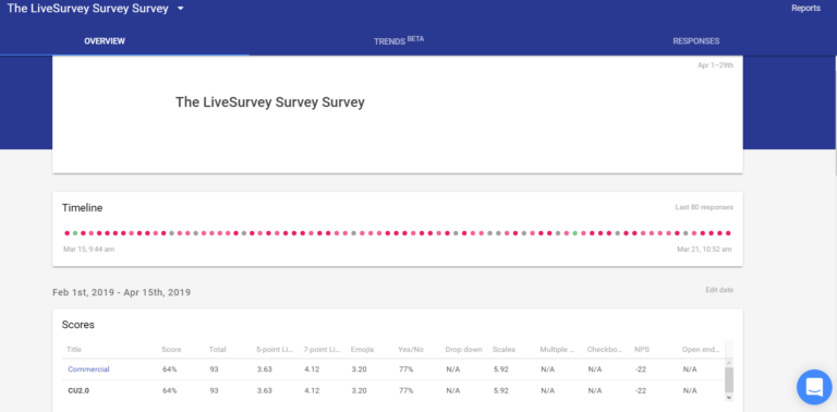
They figured the best way to learn was to ask. They opened up LiveSurvey, started a blank template, and got to work. They dubbed it the “LiveSurvey Survey Survey,” which was probably confusing to many people. (We liked it anyway.)

Adding the questions was simple and intuitive. Within minutes, I had a full survey prepared. I edited it, ran it past the other members of the CU2.0 content team, and we put together a mailing list.
Here’s what I learned.
Survey Question Types
Included in LiveSurvey are a multitude of different survey question types. In fact, LiveSurvey includes more question types than are featured in this blog. There were too many to include in a single survey! These are the ones that CU 2.0 included.
1. 5-Point Likert Scale
Fun fact about Likert scales: “Likert” is named after its inventor, psychologist Rensis Likert. His last name rhymes with “Hickert.” It would certainly explain the old psychology joke, “Likert? I hardly knowert!”
Likert Scales are 5-. 7-, or 9-point scales that allow respondents to indicate to which degree they agree with a statement. The idea is that they quantify things that are usually difficult to quantify, such as human emotion.
CU 2.0 asked:
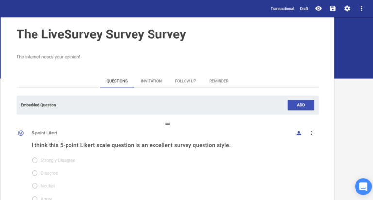
And here’s the culmination of 93 responses:
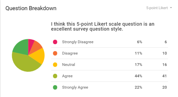
So, what does this tell us? Even without seeing the other question types, it’s clear that 5-point Likert scales are well-appreciated. Only 17% of respondents had a negative opinion of 5-point Likert scales. 66% of respondents had a favorable view overall.
Conclusion: the 5-point Likert scale is a very effective survey question type. It requires very little effort from respondents, shows all available answers, and doesn’t ask for explanations.
Recommendation: use 5-point Likert scales.
2. 7-Point Likert Scale
7-point Likert scales give respondents more options than do 5-point scales. This allows for a little more grey area and nuance.
It also complicates things.
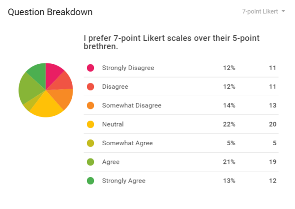
38% of people thought that 5-point scales are more effective than 7-point scales. 39% of people thought that 7-point scales are better, and they a little more strongly about it.
Conclusion: the 7-point Likert scale isn’t much better than a 5-point Likert scale. However, adding additional responses might turn off less-patient respondents. You probably won’t turn off respondents by offering the truncated version of this scale, though.
Recommendation: use the 7-point Likert scale only when the 5-point scale really, really doesn’t cut it.
3. Emoji Likert
What happens when Millennials start putting together surveys? You get unorthodox survey answer formats. Meet the emoji Likert:

The survey isn’t trying to get us to understand the more cryptic emojis out there. No need to figure out the 100, the fire, and the party ghost emojis. These faces make it pretty easy and straightforward.
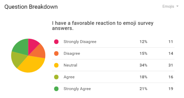
Surprisingly, emojis were 39% favorable to only 27% unfavorable. Perhaps there’s something about the bright visuals, the slight change in answer appearance, or the continued introduction of Millennials and Gen Zers in the workforce may contribute to a more favorable attitude toward emojis. Who knows.
Conclusion: emoji scales help to break up the monotony of regular scales. Use your own good judgement when using them, though. They’re not as favorable as traditional 5-point Likert scales.
Recommendation: it’s probably best not to overuse emojis, as it would detract from their novelty. Use sparingly, though they’re not verboten.
4. Yes/No Questions
Some questions are just obviously better than others. In case you were worried that this whole article gives tentative “go-aheads” to every question type, then this one will quash that fear.
Take a look:
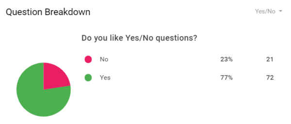
More than 75% of respondents like Yes/No questions. Comparatively speaking, that’s monumental. For what it’s worth, it’s the clearest example we have of an effective, favorable survey question. It’s simple, doesn’t require much thought, and always gives a definitive answer.
Conclusion: respondents overwhelmingly appreciate Yes/No questions. There may not be room for nuance, but in many ways, that’s a strength. Fewer options means that participants don’t have to think too hard to find the best-fit answer.
Recommendation: use Yes/No questions liberally, within reason. Due to their ease and popularity, they may be particularly effective early in surveys to reduce initial friction.
5. Drop-Down Menus
Drop-down menus present—you guessed it—a drop-down menu that contains different answers. They look like this:

And, when you click on the drop-down menu, you can see all the available answers. If there are many possible answers, you can scroll through to find the appropriate one.
Here’s what it looks like when you hit the drop-down menu:

As you can see, it’s a pretty simple, compact way to give a variety of answers. Although CU 2.0 used the drop-down menu as a makeshift Likert scale for the purposes of this article, drop-down menu questions are actually much more flexible.
For example, you could ask, “which is your favorite ice cream?” and then list as many as you’d like: rocky road, mint chocolate chip, French vanilla, and so on. Drop-down menu survey questions also don’t take up as much room on the page as do multiple choice questions.
But how do people feel about them?
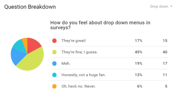
The general consensus is that drop-down survey questions are fine. Few people are ecstatic about them, but they certainly get the job done. With fewer than 20% of respondents reacting negatively, they may certainly fit into any survey without much issue.
Conclusion: the range of answers that drop-down menu survey questions offer is significant. They do require extra steps on the part of the participant though, so take caution not to test their patience.
Recommendation: use drop-down menus when space is a concern.
6. Scales
Scales allow participants to answer on a range. They’re a little like Likert scales, but it allows a wider range of questions and answers. CU 2.0 was a little cheeky and gave this scale a range of 3–8, which is essentially a 1–6 scale, but more annoying. Plus, it doesn’t let people give a neutral answer (which many survey respondents appreciate).

Responses break down as follows:
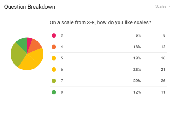
Apologies for the colors on the wheel—it’s a little tough to discern between “5” and “6.” Still, the numbers paint a clearer picture: overall, scales have an overall approval rate of 64%, which puts them pretty much in line with Likert scales.
Conclusion: scales and Likert scales accomplish the same basic thing. People feel comfortable answering either, as they’re both simple and straightforward.
Recommendation: use scales when Likert scales aren’t appropriate for the question or if you need more than 5, 7, or even 9 integers on the scale.
7. Multiple Choice
Here’s a little something to remind you of your scholastic days. Multiple choice questions offer a range of different possible answers for which one will be the best fit.
But do preloaded answers give people enough choice?

Let’s see how people like multiple choice survey questions:
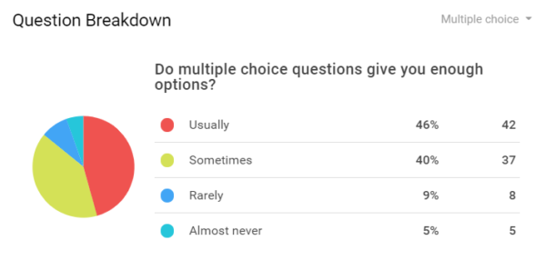
Well, with responses that indicate an 86% positive response rate, I’m just gonna call it: people like multiple choice questions on surveys.
Conclusion: multiple choice survey questions are low risk. So long as you provide a decent set of possible answers, people will probably find something that works for them. Maybe this question format is so popular because of all the standardized tests students take. Who knows.
Recommendation: use multiple choice questions as much as you’d like. Multiple choice questions are right up there with Yes/No questions.
8. Checkbox / Select All That Apply
CU 2.0 cheated a little on this one:
They made the questionable assumption that “checkbox” and “select all that apply” questions were enough like multiple choice questions that they wouldn’t have to ask how people felt about them.
However, they still wanted to include the question type. So, they asked another critically important question:
How many questions is the right amount of questions?
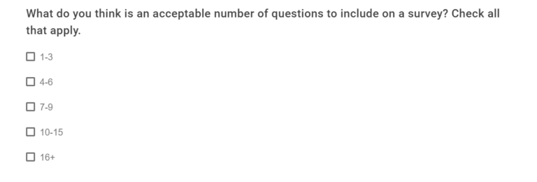
Most people hate long surveys. There’s no reason to find sources for that because it’s just true. Even paid surveys can be an aggravating chore. CU 2.0 was smart to keep their own survey under ten questions.
But what did respondents think was the best number of questions to ask in a survey?
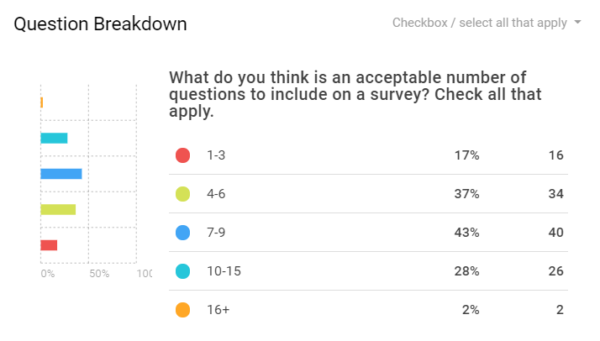
This is where things get a little fuzzy. CU 2.0 had no real methodology to evaluate the exact number of questions to ask in a survey. However, they did use a little educated guesswork.
The majority of participants indicated that 7–9 questions is a sweet spot. People also seemed okay with 4–6 or even 10–15 questions. However, because respondents were allowed to choose multiple options, we can safely assume that many people chose two or three answers that suggest a broader range of acceptable survey lengths.
People preferred survey lengths of roughly 5–10 questions, give or take a couple.
Conclusion: if you put too few questions on a survey, you risk not getting enough information. However, if you include too many, then you risk driving people away with an outsized demand on their time.
Recommendation: Keep your surveys to something that would fit on one page. 5–10 questions is perfectly fine.
Caveat: if you’re running a relationship NPS drip campaign, you can probably scrape by with fewer questions.
9. NPS Questions
Speaking of relationship NPS drip campaigns, they included one NPS question on their survey survey.

Scores of 0–6 are negative, 7–8 are neutral, and 9–10 are positive. Unfortunately, CU 2.0’s respondents didn’t care much for the survey survey, so they withheld that information. They didn’t want proof of “how bad their survey really was.”
And that doesn’t matter. What does matter is that you know what relationship surveys and transaction surveys are (and how you can use them).
Why?
Because they’re a barometer for your organization’s success. With NPS scores, if people don’t like something, you’ll know. If they don’t like you, you’ll know.
And, if you don’t know, you may not realize that you need to change something (and fast). Sticking your head in the sand and ignoring bad results won’t help you improve in the future.
So, I convinced them to take my advice: embrace your scores. Bad scores are an opportunity for change. And it’s important to own up to your shortcomings if you want to improve on them in the future.
So, they shared their “survey survey NPS score:
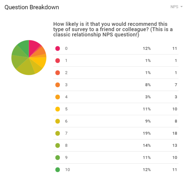
Honestly, we’ve seen worse. It even looks good at first (or at least, it would if it were a regular scale). Out of 93 participants, 41 were detractors. 31 were neutral. Only 21 were promoters—one of whom is a LiveSurvey employee.
Ouch.
Conclusion: relationship and transaction NPS surveys are super important. The question included in the survey doesn’t indicate that at all, but it’s true nonetheless.
Recommendation: definitely use NPS survey questions to evaluate your members’ or customers’ experience with your products and services.
10. Other Questions
CU 2.0 didn’t include every survey question type available. For one, they didn’t want to send out a long survey. It’s never a good idea to ask too much of survey respondents—after all, they’re donating their time and opinions for no immediate reward.
They didn’t include ranked choice questions because they need a lot of user input. The survey results did indicate that participants prefer question and answer formats requiring minimal user effort.
Also absent from the survey were grid questions. Currently, LiveSurvey does not currently support this question/answer type. Still, we’re constantly improving our platform, so we may add that soon.
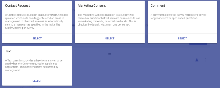
A few other things that didn’t make the final cut: checkbox, contact request, marketing consent agreement, and comment/text answers. However, they included an open-ended comment section on one multiple choice question.
Strategies to Increase Survey Response Rates
There are a few broad conclusions to draw from the LiveSurvey Survey Survey. If you want to increase your survey response rates, you should remember the following key points.
- Respect your respondents’ time and energy.
If you’re not rewarding the participants, then keep the questions to a minimum. Make your surveys short and sweet.
- Make the questions easy to answer.
Yes/No questions, Likert scales, and multiple-choice questions are easily recognized and understood. Also, there’s only one best-fit answer, and respondents can click the most appropriate option without any mental gymnastics.
It was subtle, but most Survey Survey respondents indicated less favorability toward questions that required minimal effort and time commitment.
- Keep the content relevant—pay attention to timing.
This should almost go without saying, but you can never be too careful. If you run a credit union and you send a new member a survey about one of your products or services, make sure that it’s a product or service that the member has some experience with, first.
For example, if a member signs up for a credit card, don’t survey them about the card the next week. Give them time to use, understand, and evaluate the card first.
More importantly, don’t send a credit card survey to every member. Members without cards will either ignore the survey or skew the results.
Finally, if you survey a member about a branch visit, do it shortly after their branch visit. Don’t wait two weeks. That member won’t give you reliable information so long after their visit.
How to Increase Survey Response Rates
There’s no silver bullet for increasing survey response rates. There are many strategies for increasing response rates, but they work better when used together. For example, some strategies include:
- Paying for survey responses
- Reducing the number and complexity of questions
- Send reminder emails
But ultimately, increasing survey response rates takes a combination of many strategies. In all honesty, choosing the right question types for your survey might not have much effect on its own. Yet, in conjunction with other strategies (linked throughout this blog), it might make all the difference.
Additional Reading
Understanding member experience is key for credit unions. The member experience is the entire credit union raison d’etre, after all. So, to keep your members happy, you’ll want to check in with them to ensure you’re delivering the experience you’re selling.
Subscribe to our blog to read more about credit union surveys and survey strategy. Or follow the links below to see what else we’ve written about lately.


